Brand Standards
Maintaining quality and consistency across all Rotary and ESRAG
communications is pivitol in the success of our messaging. These
brand standards offer regional chapters the information and tools
to ensure all content is on brand and in line with our core.
Logo
Here are the primary logo lockups for ESRAG.
Do not adjust the relationship between the ESRAG and Rotary logo.
The colour ESRAG logo lockup should only ever be used on a white background.
![]()
Palette
Our Core Identity Palette and our extended palette are the only colours we use for communications.
Please follow this general rule of thumb:
the more public facing the piece, the more appropriate it is to use the core identity palette within communications.
If you are only allowed to work with limited color, it ís best to select from the core identity palette as well.
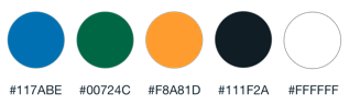
Core Identity Palette:
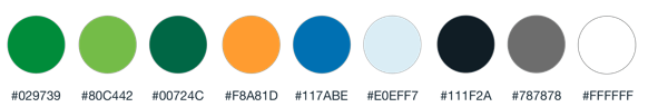
Extended Palette:
Typography
Helvetica Neue is the only typeface to be used when creating any content relating to or representing ESRAG.
Headlines & Titles:
Helvetica Neue, Bold.
Body copy & details:
Helvetica Neue, Regular
BUTTONS AND LINKS:
HELVETICA NEUE, BOLD, UPPER CASE.
Imagery
When selecting imagery, ensure it is high resolution, vibrant and good quality like the examples below. All imagery must be royalty free for commercial use or approved by the photographer for use.

Approved imagery can be found here:
Social media
Profile Image
The primary logo colour for ESRAG should be used as any regional chapter’s profile image across all social platforms. Do not add any additional information or regional names to this logo.
The logo file to be uploaded should always be in a white square so that it sits centrally in any container.

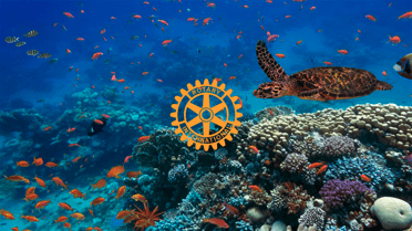
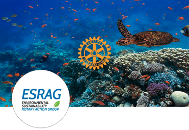
Cover Image
Should the social platform offer it, a cover image can created from a high quality picture that is representative of the regional chapter.
The Rotary lnternational logo may be placed centrally on this image as seen in the example. The logo should be legible. If this is not possible, do not add the logo. Do not add text over the cover image.
Cover image with logo:
Example of cover image in situ with profile image on Facebook:
Creating content
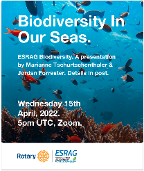
Have a clear title that is the single focal point in your image.
Make sure there’s enough contrast. Contrast provides balance, is easier to read and is more accessible.
Keep it simple. Make sure your visual is easy to understand.
Use our brand colours and brand font.
Is it readable? Check how quickly can someone find information like date or time. If it’s not instant, there’s too much going on.
Use the post to add details, don’t put it all into the visual.
Can I read it on a mobile? Is the text large enough? Consider that not everyone will be using a big screen.
Good example:

Great example: